Wednesday, December 8, 2010

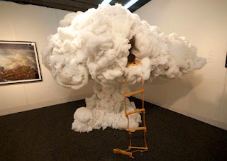
Up in The Clouds Luminaire Final

Front View- Focus on Clous Shape

Full Front View- Cloud and Legs


Side View


Bottom View (Not visible unless lying underneath)


Detail View of Layers- Layers were accomplished by sewing the paper together so that it overlapped to create shadows amongst thicker paper.

Detail Side View

Materials- Cloud: Craft Paper, Wire, Fishing Line, Pipe Holders, Wood, 2- 15 W CFL bulbs, A Few nutz and boltz and TLC

Legs: Wood, Paint

Up in the Clouds

Our final project in studio was to create a luminaire, based on a natural light phenomenon.  My light phenomenon was a large body of clouds, with the sun at the very base of the clouds, illuminating the mass of clouds so brilliantly it seemed to be bigger than anything I could imagine.  I wanted to take this idea, illuminating a mass of clouds and turn it into something real; I wanted to build my own cloud.  Cliche? Well, have you have seen a cloud up close?  Have you been able to hold a cloud?  Walk up to one and around it?  Now you can. 


Early Cloud Light Model
Building the cloud- Base

Base- Side view

Base with Half of Cloud and Bulbs Attatched


Completed Cloud In Natural Light- Not turned on


Turned On in Natural Light


Critique- Monday, December 6, 2010

     On Monday, December 6th, 2010 I was assigned to attend the 2nd year Iarc critique located in the lobby of the Gatewood Studio Arts Building at UNC Greensboro.  The focus of the 2nd year's fnal projects was showing movement through form.  The students had to represent a movement or a flow using a statis material.  Various students used plastic, wire, and glass.  The one that I found most interesting was Jasmine Jones and her project on showing fluidity using wire mesh. 


Left Half of Jasmine's Project Board


Right Half of Display Board


Jasmine's Display Model
  I enjoyed Jasmine's project because of her thorough look at how her ideas developed.  I liked her documentation of process and how she explained how she created the fluid figures. 

She said the metal in the wire mesh imspired her because it reminded her of water, with the reflective qualities of metal. 

Jasmine created the shapes using points on her hands and tried many different variations of shape.  I think that he project demonstrates a confident grasp of understanding 3D Models and Shape of Movement, and that which is not necessarily a figure.

Friday, November 12, 2010

Luminaire Project Inspiration-Less Lighting, More Arting

A few more photos I stumbled upon looking up cloud installations and cloud art.


I find the installation to the left very interesting.  I think the artist is following the same idea track that I am with the luminaire, in that we want to create what we cannot actually experience so that we can experience it.  In this case, the artist wanted to build a cloud treehouse/fort/castle, whatever it is, it, at one time, only existed in the mind of the artist.  In my case I wanted to build a cloud.  I've never been able to hold a cloud in my hands, or look at it all around it without flying around it.  Though there are no lights in the piece, it inspires me because of it's scale and the creativity the artist used to create it. 


http://picocool.com/story/title/hand-cut-paper-cloud-artwork


I found the photo to the left interesting because the artist found a way to make the clouds 2D, yet still very full and cloud like.  The depth of the cloud is up to the perception of the viewer, which I enjoy; leaving some of what the viewer is viewing up to interpretation.  


http://www.bustler.net/index.php/event/sci_arc_exhibition_iwamotoscott_architecture_voussoir_cloud/


Detail View (Left), Artist working on installation (Right)

The two photos of the installation above are particularly interesting to me because they are made out of wood, which is not an ideal cloud making materials.  The installation was designed by an architect rather than an artist, which makes sense because the cloud is broken down into geometric shapes rather than flowy lines typically categorized with a cloud.


I liked this installation piece because I found it funny.  I have never seen a cloud being held up by anything, much less anything visible to the human eye.  The piece makes me think that everyone needs a little help sometimes, even natural phenomena such as cloud bodies.  

http://www.dsmorris.com/installations.html#img/chandelier_1.jpg

I like this wall sconce installation because it is relevant to the project because it includes light, but I dont think it is intended as a light source.  I think the light is more to highlight that the pages making the shape have words and have information, so as to say after you viewed it once, you should take a step closer and view it again.
http://www.toxel.com/inspiration/2009/01/26/beautiful-umbrella-art-installations/

I found this installation interesting because it is made of umbrellas.  How ironic that someone would make the sky out of something usually used to protect you from the sky.  


All of the websites I visited gave me the same general thoughts; I want to make something more abstract, I want to use other materials, and I want the impression of a cloud, not necessarily a cloud hanging in a room.  Simple right?


Luminaire Project Inspiration

Some lights I found while googling 'cloud lights'.


http://reflectionbuilders.com/Specialty_Work.html


http://www.design-conscious.co.uk/mall/designconscious/products/product-119975.stm


http://www.dezeen.com/2009/01/12/cloud-lamps-by-yu-jordy-fu/


http://www.dezeen.com/2009/09/30/cloud-walk-chandelier-by-yu-jordy-fu/


http://www.thisnext.com/tag/cream-puff-light-glow/


http://www.muleh.com/_light/_light.php?product=cloud_hanging_lamp

Sunday, November 7, 2010

Some Portraits...

Just doodling in class.  Each sketch took between 10 and 15 minutes.
Jaklyn

Hayden

Peer Sketchz

   While flipping through Matt's sketchbook I noticed his sketch style is very different from my own.  Matt sketches with swift lines to get down general ideas, with details added later, over the gesture lines.  I think the style is displyed clearly in this sketch, as the stick is made with what appears to be softer lead than the lead designated to detailing the notches of the stick.  I picked this sketch because of the simplicity of Matt's sketches.  His swift lines would make one think they are just to get an idea down, but his attention to curves and movement in the stick show that though his first line may be swift it was thought out before he drew it.  Also, I usually associate simple drawings with cliche images for things, but though these drawings are simple with minimal detail, they show that he looked at the sticks to get every curve right rather than imagining where the curves and twigs may be placed.


     While flipping through Molly's sketchbook I noticed a very different sketch style.  Molly's sketch style is carefully thought out and detail oriented.  In this sketch, especially, I like the attention to detail on the border of the leaf. The border twists and turns, and it shows that she spent alot of time trying to get the shapes right.  I appreciate the patterns in the leaf and the attention she gave to the leaf as a whole.  I picked this sketch, mostly because of the detail in the sketch.  I think the leaf looks very life like and the darker lines almost appear to make the leaf look translucent.


Kudos, Ya'll.

Paul Friedlander

Paul Friedlander pictured with work.
      Dark matter. Invisible existence of matter and light.  Creating that which is not there, to see.  These are just some aspects of design light artist Paul Friedlander considers when creating light exhibitions.  Paul Friedlander is a British born physicist and kinetic light sculptor.  Growing up as the son of a professor at Cambridge
University, Friedlander recalls spending long days in his garden, absorbed in his own fantasy world.  His first recollection of the news on television was when he was at the age of 6, as the space age began with Russia sending the sputnik to space.  It was probably then that Friedlander's fascination with space and cosmology and light began.  He describes himself as being a strange child, with little interest in typical child activities.  His interest in music sparked with the release of the first Beatles album.  In a matter of months Friedlander found his place in the world we refer to today as the counter culture; growing his hair long, rebelling, and later dabbling in the world of cults.  In school he did well in  physics and mathematics and art(not surprising as his mother was an artist).  In 1970, college, Friedlander visited the Hayward Gallery to view the kinetics show.  
Chromastrobic Light Sculpture not spinning
"I came away from the show convinced that I knew now what I wanted to do with my life. I wanted to create kinetic art. I set about this without delay. I became enthusiastically involved in making kinetic works in my spare time. Very soon I found myself spending more time making art than working on my studies. I set up a simple workshop in my house and found a new way to live."
Chromastrobic Light Sculpture spinning
   Holding degrees in physics and maths from Sussex University, Friedlander dabbled in cosmology and interstellar propulsion, but later walked a different path, switching to stage lighting design, scientific art, and light sculpting.  Friedlander designed light art to play behind the Electric Sound Orchestra, where he created light images to match the sounds the orchestra created.  He later created a series of sculptures using chromastrobic light.  The sculptures, when spinning give off light illusions.
    More recently, Friedlander has focused on light sculpture.  He uses chromastrobic light broadcast on string to create his illusions of bent and twisting light.
 His interest in kinetic light art has led to his success, having exhibited on 3 continents and 12 different countries in his career as a light artist.  

Paul with light sculptures
    As a designer, I think the most interesting aspect of Friedlander's work is that he strives to create what he cannot see, but he can imagine.  His pieces of work are not only pleasing to the eye, but spark one's interest.  They cause you to wonder, how is the light moving in a circle? Are the lights really making that shape, or is my brain trying too hard to interpret what I am seeing?  With Friedlander's interest in science and cosmology, I think that it is necessary for questions like this.  Friedlander's work is brilliant, in how deep he goes to create what he envisions.  I think one of the hardest things about the luminary project is learning to manipulate light.  Forget having an understanding of light in its scientific form for this gal, because though I understand the connection between light and energy, I don't understand the complexity of light.
Dark Matter
     In some of the articles I read about Paul Friedlander, people described much of his work stemming from the psychedelic era.  I think this observation is interestingly relevant to his work, but as far as I could find on his personal website, he mentioned no credit to drugs or hallucinogens for his curiosity of lights and movement.  I think the idea of creating shapes and objects of light is kind of scary for some people, because it is a difficult concept to grasp, and people don't always like to believe what they cannot recreate themselves, or hold in their own hands. I do think that it is very cool that he has direct references to subculture artists, such as Pink Floyd, as he named one of the two giant lights in his piece Dark Matter, the Big Eye.
      I have a great appreciation for Pail Friedlander not only as an artist, but as a scientist, a sculptor, and a creator.  I think his motivation to create something he has never really seen with the naked eye before, and beyond that to understand it enough to create it is amazing within itself.

credits:
Interactive Architecture
Friedlander's Personal Website

Monday, November 1, 2010

The sky is the source of light in Nature and it governs everything. (John Constable)

Wednesday, October 27, 2010

Interesting Snapshot Perspective Picture

Manipulation of a 2x4 Final

front view

close up view from front

close up view of slivery wood to show depth of layers

full front view

close up of inside left grooved panel to show joint of wood slivers and grooves

view of top right and right side to show finger joint

top-right side view 


Manipulation of a 2x4

In this project we were given a 2x4x18 in piece of wood.  We had to use only wood, no adhesives, and the wood had to be made into something that is able to support itself- the wood shouldn't just be laying on top of itself.
first time using the ban saw 


first time using the table saw

table saw grooves front view

side view of wood with grooves

showing how the grooved wood and slivery cut outs ideally fit together

more cut outs using the ban saw

playing with the cutouts and tinkering with negative space