Showing posts with label Visual Communication. Show all posts

Tuesday, November 15, 2011

More fun signage to check out...

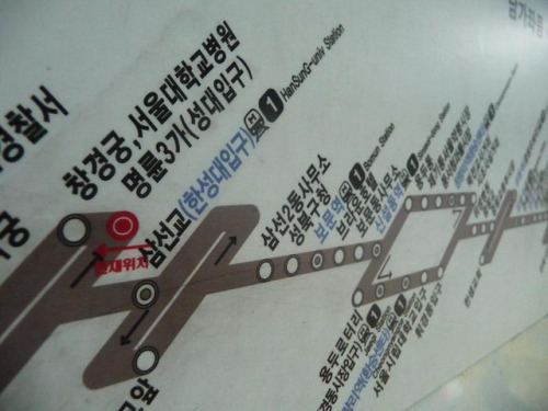
Seoul Subway Map
Purposeful Signage
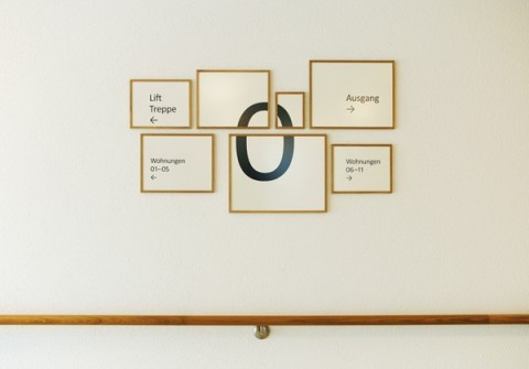
Zurich Retirement Home Signage
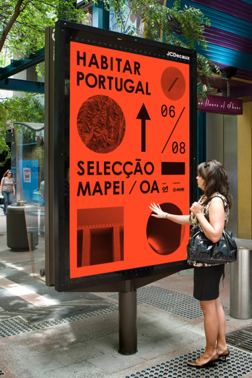
Portugal Street Signage
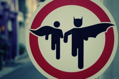
Batman and Robin Zone...
 
Sign in the Dublin Zoo


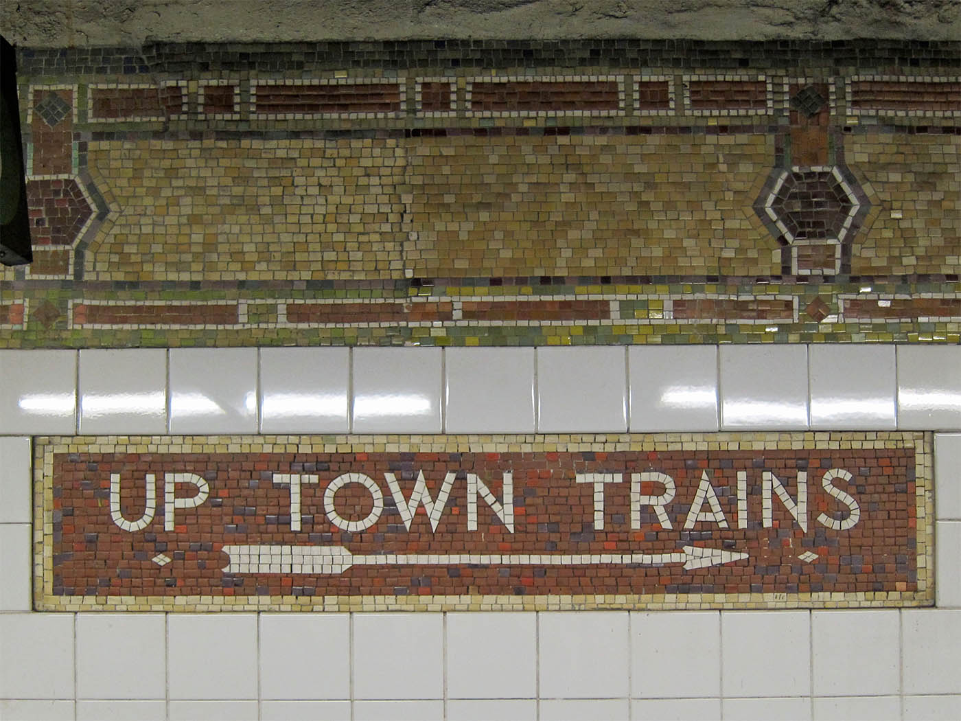
I've always been very fascinated with not only subways but also the mosaic tiles in older subways that give it the creepy vintage feel.  This sign, located at 86th Street in NYCreally echoes the times the subways has lived through


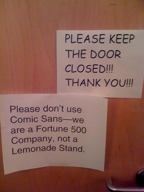
Typeface is everything


Signage Precedence


This is my first example of interesting signage.  I like the layout of this signage because it is appealing and draws the viewer towards the sign.  Colors are fun and inviting and mesh well with the colors located around the rest of the room.  The signage is flat and painted onto the wall as to not take away from the design of the room.


This example of signage is from the Milwaukee Art Museum.  I like this example because it is simple and incorporates both material items as well as information on the monitor above.  The layout on the tv echoes the repeated shapes on the wall below as well as the blocks of color in the background and probably around the rest of the museum.


I chose this office signage as my last collection of signs because it is an interesting way to switch the normal office signage up.  I like the layout of this sign because it is laying different materials over one another which i think really works for this space since the wall is glass.  The sign helps the office to stay open and airy while clearly indicating where things around the office are located.


Thursday, October 27, 2011

Instructions Gone Wild


Do it yourself projects always seem to be less of a hassle and less time consuming.  Sometimes the opposite can be true and you can be found spending a longer time trying to read what the directions are trying to tell you than actually understanding how to put your project together or accomplish your task efficiently.  

Turning back the odometer on your European sports car may seem difficult to the average person.  Noted by these do it yourself instructions, it is.  The top right corner clearly states this task may not be the easiest feat to accomplish.  The instructions show step by step instructions, using minimal wordage, so as to keep the page simple and not over crowded with information.  The steps are pretty clear to any person with general knowledge of cars (me for example) and the materials are well illustrated.  If I had a European sports car, and I wanted to turn the odometer back, I think this poster would successfully aid me in doing so, with the help of another person with equal or more knowledge in automobiles.  This poster is a pretend instructional poster mocking the 1980's hit movie Ferris Bueller's Day Off.  The next poster in this sequence should entail how to successfully remove car parts from foliage when dispersed upon impact.

This poster, clearly intended for young children, shows how to properly wash your hands.  Using cartoon figures, bright colors, and visually informative photos, the poster is appealing to the younger generation and seems as if it would be easy to know how to correctly wash your hands given the directions.  This poster is successful because it will keep the readers attention while making it simple to read.

The last poster I chose is somewhat looser and for more informal use.  This illustration shows step by step instructions on how to tie a tie.  In this illustration the visuals are the only guides, showing steps by repeating the same basic image with one or two changes.  

http://www.lugaluda.com/wp-content/uploads/2010/04/How-to-tie-a-tie.jpeg
After looking through many instructional posters, I have found myself liking the conceptual graphic design flavored posters, such as the first poster.  I think it really shows when you enjoy you're work and making an instructional poster a little more fun, will in turn make the reader more interested in following the instructions.

Tuesday, September 20, 2011

Reception Desk Inspiration!

While working on a short project for Visual Communication dealing with reception areas, I decided to look at a few other reception areas for inspiration...


I found this appealing because of the movement of the space and the way the desk mimics the form of the wall behind it.  The desk works well in the space because it contributes to the flow of the room.


I chose this reception area because it is so different from the one before it.  The eclectic use of furniture makes the space more interesting and allows for a cohesive design.


These two spaces are just 2 examples of precedence.  I appreciate them because of their cohesive design and the thought put into the furniture working with the walls around it. I think in a reception area, the furniture makes the space and these spaces have great furniture that make the rooms what they are and give them each their own identity.

Friday, September 2, 2011

Greensboro History Museum Diagram & Narrative


   "Waiting, waiting, waiting, ok walk signal...walk, walk, walk, walk faster, the lights turning yellow," are my thoughts on the crisp morning walk through downtown to the Greensboro Historical Museum.  I walked past the Summit eatery peeking through the windows, wondering what secret atmosphere lay behind the glass.  Finally I crossed the street, jumping onto the curb of the sidewalk beside the museum.  I looked up examining my surroundings.  Brick...green trim...darkened windows...gold lions....I walked towards the gold lions, expecting a grande entrance only to find a large white sign signaling the group to enter the Museum from the Lindsay St. entrance.  I walked around the corner, expecting the Lindsay St. entrance to be just as grande, though it was unfortunately just curved, sans lions.  The colors of the building relate to many famous buildings in the Greensboro area, including that of the Faust Building on UNCG's campus.  Pausing outside of the entrance, I looked up at the towering brick castle before me.  Somewhat confusing to my brain, my eyes wandered amongst the windows, wondering which of those were original and which had been replaced.  The answer unbeknownst to me, I entered the first set of doors, halfway expecting the old museum smell and an enticement of old sounds to creep upon me immediately.  Unfortunately they did not and I confusingly opened the second set of doors.  I entered the main foyer and stopped examining my surroundings.
    The set up of the furniture and displays almost forces you to chose what you want to do first.  Though there is a check in desk, it is not at standing level, so it is definitely not at eye level, which makes it very easy to over look the desk or the sign in.  There was a small clutter of display on the Jewish community in Guilford county, which I found most entertaining upon the discovery of a plate saying "Shalom Ya'll".  Though funny, the display seems unintentional and a little confused about what it is doing in the space.  In the back of the space is an auditorium, hidden by the dark shadows of a make-shift sitting area.  The auditorium is very nice and cozy, holding it's own theme, hardly mimicking the style set before it by the museum.   In the right corner of the room was a grand staircase, made dull with its forest green paint and goldish accents, and hidden beneath the stairs is a car showcase waiting to be stuffed back into to closet for a few years.  The space was very confusing to me.  I felt like wandering around the space was the best way to take the space on, so i did.  Walking around and walking around again, seeing things from every angle of the museum.  The space is an odd space, but though it is odd it will have many uses, they just need to be discovered.