

Monday, November 28, 2011
Wednesday, November 16, 2011
Cabinet of Curiosity Shelf Concepts
For my cabinet idea I have been looking at balancing hard and soft spaces. I didn't want to make a normal, run of the mill cabinet, so I decided on more of a showcase-shelf kind of display. My shelf is constructed out of stainless steel/aluminum/brushed nickel...something with a reflective quality that still has a pretty smooth finish, with glass bulbs to cover the artifacts. Around each of the glass bulbs is a small light to help showcase the artifact and create a light effect through/on the object or its container.
From left to right, the artifacts go from the cat collar box, to the tip of the reflective wave where you will find the silver bell, and below the curve the ring. In the cat collar's bulb, the light is located on the left side and in front of the box. I decided on two lights for this one only because the box has holes to see the collar through and I wanted to introduce the effects of light through those holes, which will probably create a circle light effect on the inside. For the bell, the light is located in the front below the bell. I chose to put it there because the bell container has a single opening in the front and if it is silver, as originally intended, the box should already have reflective qualities. The light for the ring box is located above the ring, so as to really create a dramatic light affect on the ring itself. The location of the lights helped determine where each artifact should be located.
I chose to create bubble-like bulbs to help showcase the objects and encourage the artifacts and their containers to be viewed from many angles, so the sphere shape really helps with that. Each artifact sitting on the silver curve have a small base to level the artifact. I chose encasings rather than an open shelf to play on the idea of creating a container for a container of an artifact. Another thing I noticed was all of the artifacts shared a round quality and were being put into a box of sorts, so I wanted to do the reverse and put the boxes in the circles.
My color palette is simple as it is a reflection of my materials (literally). I wanted to keep the palette clean and simple so as to unify the objects and show the "reflection" in the personal items.
Finally, I chose this concept because I like the idea of a heavy curve looking like it is balancing on a bubble. I think the optical illusion is very appealig to the eye and, again, helps draw the viewer to closer examine the artifacts and their containers.


Tuesday, November 15, 2011
www.lifemylief.com
More fun signage to check out...
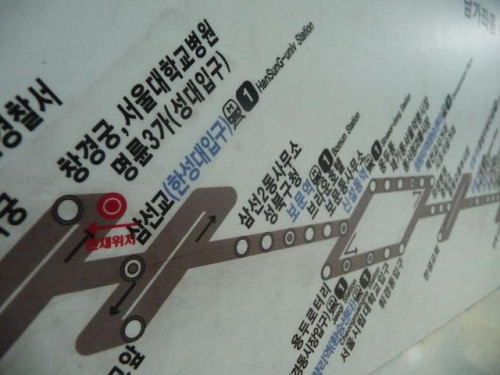 |
| Seoul Subway Map |
 |
| Purposeful Signage |
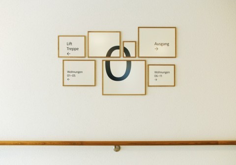 |
| Zurich Retirement Home Signage |
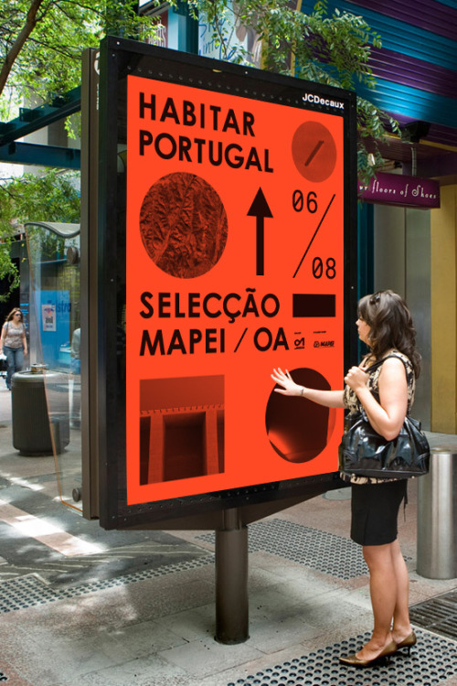 | |
| Portugal Street Signage |
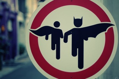 |
| Batman and Robin Zone... |
 | ||
| Sign in the Dublin Zoo |
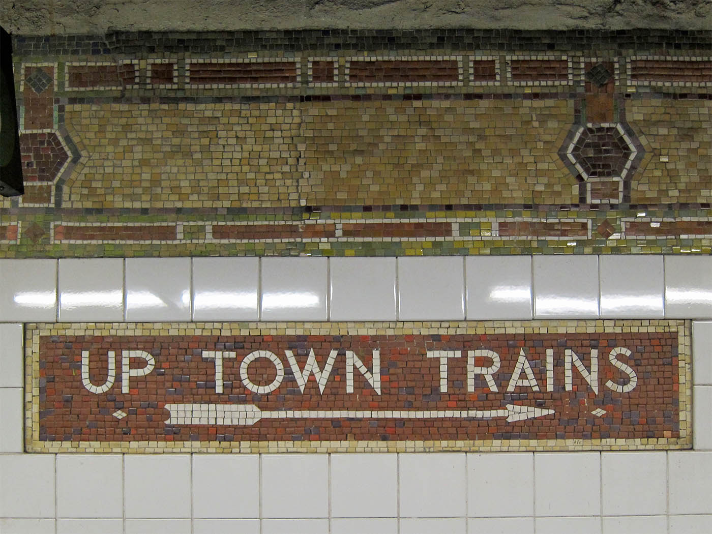 | ||||||
| I've always been very fascinated with not only subways but also the mosaic tiles in older subways that give it the creepy vintage feel. This sign, located at 86th Street in NYCreally echoes the times the subways has lived through |
 | ||
| Typeface is everything |
Signage Precedence
 | |

This example of signage is from the Milwaukee Art Museum. I like this example because it is simple and incorporates both material items as well as information on the monitor above. The layout on the tv echoes the repeated shapes on the wall below as well as the blocks of color in the background and probably around the rest of the museum.

I chose this office signage as my last collection of signs because it is an interesting way to switch the normal office signage up. I like the layout of this sign because it is laying different materials over one another which i think really works for this space since the wall is glass. The sign helps the office to stay open and airy while clearly indicating where things around the office are located.
Thursday, October 27, 2011
National Museum of Natural History Light Installment
Finding a flarfing...
Flarf.
Sounds funny huh? Flarf is a type of poetry, until recently I had never heard of before. Flarf poetry has been characterized as an avant garde poetry movement of the late 20th century and the early 21st century. It is an interesting form of expression, and isn't easily understood by all who read it. To create Flarf poetry, the first creators began to search Google with odd search terms, taking the phrases of results and coupling them with other random found phrases to create a poem. The poems use an odd aesthetic, as the movement is dedicated to exploring the inappropriateness of the art form. The results of these poems usually yield hilarious and sometimes disturbing creations, in various forms of text and presentation. The term Flarf was originally coined by the poet Gary Sullivan, one of the earliest Flarf writers. Here is an example by poet Katie Degentesh:
When I first began reading flarf poetry, as recommended by a few friends, I didn't understand it. I thought it was a waste of energy and an un organized excuse for a poem- anyone can take google search results and slap them onto a page and call it a poem...right? Maybe not. Though the poems are discombobulated, they seem to follow a common theme, and when they don't they almost seem as if it is a stream of consciousness. I have found that writing a stream of consciousness without woe, can turn out to be a beautiful thing, because sometimes we second guess what our mind is trying to relay to our brain.
The reason I was introduced to flarf poetry in the first place, was due to the website www.livemylief.com . The website is a creation of Steve Roggenbuck, a 23 year old Chicagoan and self proclaimed poet. Steve, together with a few behind the scenes editors, manages the website, creating bits of poetry, videos, gifs, photoshopped creations, and more. Using the internet as his form of sharing his poetry, he has acquired followers and friends alike that regularly keep up with his videos, as he posts them daily and weekly. The website has a variety of things on it, including rants, silly tangents, mock yoga, and reinterpretations of already created art. One of my favorite things that steve does is print flarf poetry on large white cards and posters and displays his poetry via different posters on a video. Even better, Roggenbuck is obsessed with Helvetica font, my personal favorite.
The following video is one of my favorite videos by Roggenbuck, as he addresses poetry by my favorite poet, E.E. Cummings. In the video he takes excerpts of various poems of Cummings' and creates something new from the existing works...
Sounds funny huh? Flarf is a type of poetry, until recently I had never heard of before. Flarf poetry has been characterized as an avant garde poetry movement of the late 20th century and the early 21st century. It is an interesting form of expression, and isn't easily understood by all who read it. To create Flarf poetry, the first creators began to search Google with odd search terms, taking the phrases of results and coupling them with other random found phrases to create a poem. The poems use an odd aesthetic, as the movement is dedicated to exploring the inappropriateness of the art form. The results of these poems usually yield hilarious and sometimes disturbing creations, in various forms of text and presentation. The term Flarf was originally coined by the poet Gary Sullivan, one of the earliest Flarf writers. Here is an example by poet Katie Degentesh:
I Loved My Father
I loved my father and I loved Jesus.
What was I to do?
I felt like a canoe
that was being pulled apart by two strong men.
I expressed that eloquently by imitating his life,
by becoming more and more ineffectual daily.
People would generally hide from him
because he looked so American
I didn’t know that my father was controlling and manipulative.
I wanted to glorify Him by paying off the debt of sinful man
At least he could’ve explained why
he didn’t want me to play with the toy gun.
He really cared about us.
Maybe he had no feelings towards or against other people, either.
Rather than be exposed to one more sales pitch
They spit on me and I ran away
Nothing happened for almost a year then
He’d call the State Police just to try and settle me down
If you got your finger cut off on the
on the thought of killing him
He got angry and he wanted to get even.
I love plants and trees, but
I wasn’t allowed to go out or talk.
He was a wonderful man,
dealt with the servants of the castle
made a good living and provided well for his family
shared his affections with his boyfriend on weekends
I loved him from afar.
I sucked my thumb until I was six years old.
I didn’t realize it at the time.
When I was your age, he said,
“I had a square piece of white cloth to be made into
firstborn children of God, truly made perfect as God.”
He looked at me, and he knew I had stolen it.
A man will be hated by his own family.
I hated Listerine and I hated my father.
I do not know whether he is alive or not.
I took what I wanted, and left him spoiled behind me.
I was reborn in Ireland, in 1753.
When I first began reading flarf poetry, as recommended by a few friends, I didn't understand it. I thought it was a waste of energy and an un organized excuse for a poem- anyone can take google search results and slap them onto a page and call it a poem...right? Maybe not. Though the poems are discombobulated, they seem to follow a common theme, and when they don't they almost seem as if it is a stream of consciousness. I have found that writing a stream of consciousness without woe, can turn out to be a beautiful thing, because sometimes we second guess what our mind is trying to relay to our brain.
The reason I was introduced to flarf poetry in the first place, was due to the website www.livemylief.com . The website is a creation of Steve Roggenbuck, a 23 year old Chicagoan and self proclaimed poet. Steve, together with a few behind the scenes editors, manages the website, creating bits of poetry, videos, gifs, photoshopped creations, and more. Using the internet as his form of sharing his poetry, he has acquired followers and friends alike that regularly keep up with his videos, as he posts them daily and weekly. The website has a variety of things on it, including rants, silly tangents, mock yoga, and reinterpretations of already created art. One of my favorite things that steve does is print flarf poetry on large white cards and posters and displays his poetry via different posters on a video. Even better, Roggenbuck is obsessed with Helvetica font, my personal favorite.
The following video is one of my favorite videos by Roggenbuck, as he addresses poetry by my favorite poet, E.E. Cummings. In the video he takes excerpts of various poems of Cummings' and creates something new from the existing works...
I don't expect everyone that reads flarf poetry, or watches the videos on the website to like it, or even completely understand it. I think flarf is so great because each reader will be affected by the words differently, since they don't have clear intentions. This kind of poetry envelopes everything that is my generation- instantaneous action, organized chaos, and leaving the door for interpretation open. And for the record, Steve's intense love for Justin Beiber's music doesn't really have anything to do with flarf.
I think it is important for designers to explore all corners of the art world, such as poetry in this case. The idea of non relating things coming together to create one beautiful thing can work in almost any design case, especially in a group setting.
Subscribe to:
Posts (Atom)