Wednesday, November 16, 2011

Cabinet of Curiosity Shelf Concepts

For my cabinet idea I have been looking at balancing hard and soft spaces.  I didn't want to make a normal, run of the mill cabinet, so I decided on more of a showcase-shelf kind of display.  My shelf is constructed out of stainless steel/aluminum/brushed nickel...something with a reflective quality that still has a pretty smooth finish, with glass bulbs to cover the artifacts.  Around each of the glass bulbs is a small light to help showcase the artifact and create a light effect through/on the object or its container. 
     From left to right, the artifacts go from the cat collar box, to the tip of the reflective wave where you will find the silver bell, and below the curve the ring.  In the cat collar's bulb, the light is located on the left side and in front of the box.  I decided on two lights for this one only because the box has holes to see the collar through and I wanted to introduce the effects of light through those holes, which will probably create a circle light effect on the inside.  For the bell, the light is located in the front below the bell.  I chose to put it there because the bell container has a single opening in the front and if it is silver, as originally intended, the box should already have reflective qualities.  The light for the ring box is located above the ring, so as to really create a dramatic light affect on the ring itself.  The location of the lights helped determine where each artifact should be located.
     I chose to create bubble-like bulbs to help showcase the objects and encourage the artifacts and their containers to be viewed from many angles, so the sphere shape really helps with that.  Each artifact sitting on the silver curve have a small base to level the artifact.  I chose encasings rather than an open shelf to play on the idea of creating a container for a container of an artifact.  Another thing I noticed was all of the artifacts shared a round quality and were being put into a box of sorts, so I wanted to do the reverse and put the boxes in the circles. 
     My color palette is simple as it is a reflection of my materials (literally).  I wanted to keep the palette clean and simple so as to unify the objects and show the "reflection" in the personal items. 
     Finally, I chose this concept because I like the idea of a heavy curve looking like it is balancing on a bubble.  I think the optical illusion is very appealig to the eye and, again, helps draw the viewer to closer examine the artifacts and their containers.


Tuesday, November 15, 2011

Ive debated posting this due to the profanity in the video, but for the sake of design students having a laugh...here it goes...

www.lifemylief.com

More fun signage to check out...

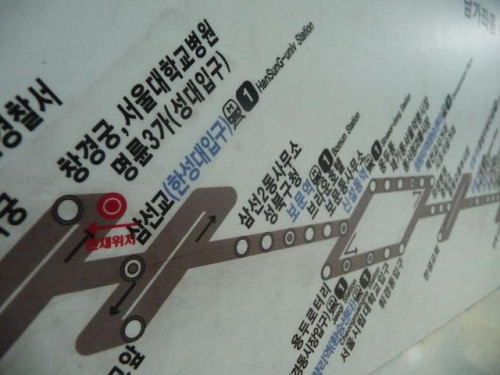
Seoul Subway Map
Purposeful Signage
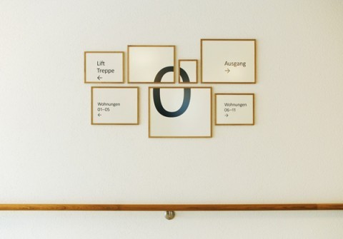
Zurich Retirement Home Signage
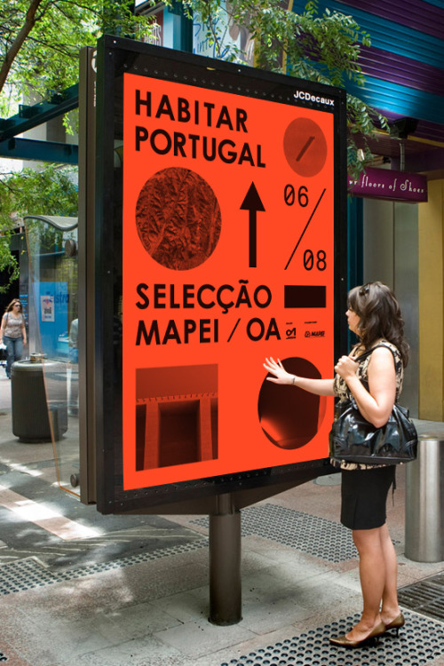
Portugal Street Signage
Batman and Robin Zone...
 
Sign in the Dublin Zoo


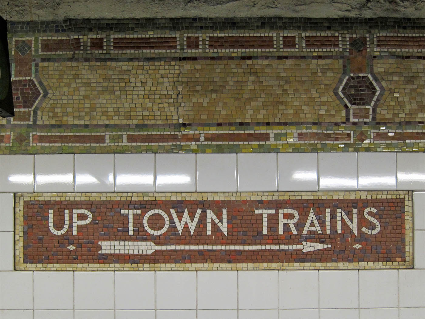
I've always been very fascinated with not only subways but also the mosaic tiles in older subways that give it the creepy vintage feel.  This sign, located at 86th Street in NYCreally echoes the times the subways has lived through


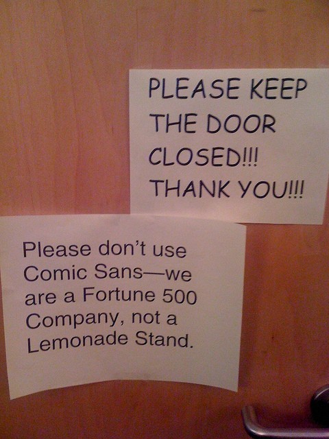
Typeface is everything


Signage Precedence


This is my first example of interesting signage.  I like the layout of this signage because it is appealing and draws the viewer towards the sign.  Colors are fun and inviting and mesh well with the colors located around the rest of the room.  The signage is flat and painted onto the wall as to not take away from the design of the room.


This example of signage is from the Milwaukee Art Museum.  I like this example because it is simple and incorporates both material items as well as information on the monitor above.  The layout on the tv echoes the repeated shapes on the wall below as well as the blocks of color in the background and probably around the rest of the museum.


I chose this office signage as my last collection of signs because it is an interesting way to switch the normal office signage up.  I like the layout of this sign because it is laying different materials over one another which i think really works for this space since the wall is glass.  The sign helps the office to stay open and airy while clearly indicating where things around the office are located.


Thursday, October 27, 2011

National Museum of Natural History Light Installment

This is a video of an art installation located in the National Natural History Museum in Washington, D.C. I thought it was interesting because it is so appealing to people of every age, and I really enjoy the jelly fish-like figures floating over head.

Finding a flarfing...

Flarf.
Sounds funny huh?  Flarf is a type of poetry, until recently I had never heard of before.  Flarf poetry has been characterized as an avant garde poetry movement of the late 20th century and the early 21st century. It is an interesting form of expression, and isn't easily understood by all who read it.  To create Flarf poetry, the first creators began to search Google with odd search terms, taking the phrases of results and coupling them with other random found phrases to create a poem.  The poems use an odd aesthetic, as the movement is dedicated to exploring the inappropriateness of the art form.  The results of these poems usually yield hilarious and sometimes disturbing creations, in various forms of text and presentation.  The term Flarf was originally coined by the poet Gary Sullivan, one of the earliest Flarf writers. Here is an example by poet Katie Degentesh:
I Loved My Father

I loved my father and I loved Jesus.
What was I to do?
I felt like a canoe
that was being pulled apart by two strong men.

I expressed that eloquently by imitating his life,
by becoming more and more ineffectual daily.

People would generally hide from him
because he looked so American

I didn’t know that my father was controlling and manipulative.
I wanted to glorify Him by paying off the debt of sinful man

At least he could’ve explained why
he didn’t want me to play with the toy gun.

He really cared about us.
Maybe he had no feelings towards or against other people, either.

Rather than be exposed to one more sales pitch
They spit on me and I ran away

Nothing happened for almost a year then
He’d call the State Police just to try and settle me down

If you got your finger cut off on the
on the thought of killing him
He got angry and he wanted to get even.

I love plants and trees, but
I wasn’t allowed to go out or talk.

He was a wonderful man,
dealt with the servants of the castle
made a good living and provided well for his family
shared his affections with his boyfriend on weekends

I loved him from afar.
I sucked my thumb until I was six years old.
I didn’t realize it at the time.

When I was your age, he said,
“I had a square piece of white cloth to be made into
firstborn children of God, truly made perfect as God.”

He looked at me, and he knew I had stolen it.
A man will be hated by his own family.

I hated Listerine and I hated my father.
I do not know whether he is alive or not.

I took what I wanted, and left him spoiled behind me.
I was reborn in Ireland, in 1753.


     When I first began reading flarf poetry, as recommended by a few friends, I didn't understand it.  I thought it was a waste of energy and an un organized excuse for a poem- anyone can take google search results and slap them onto a page and call it a poem...right?   Maybe not.  Though the poems are discombobulated, they seem to follow a common theme, and when they don't they almost seem as if it is a stream of consciousness.  I have found that writing a stream of consciousness without woe, can turn out to be a beautiful thing, because sometimes we second guess what our mind is trying to relay to our brain.
     The reason I was introduced to flarf poetry in the first place, was due to the website www.livemylief.com  .  The website is a creation of Steve Roggenbuck, a 23 year old Chicagoan and self proclaimed poet.  Steve, together with a few behind the scenes editors, manages the website, creating bits of poetry, videos, gifs, photoshopped creations, and more.  Using the internet as his form of sharing his poetry, he has acquired followers and friends alike that regularly keep up with his videos, as he posts them daily and weekly.  The website has a variety of things on it, including rants, silly tangents, mock yoga, and reinterpretations of already created art.  One of my favorite things that steve does is print flarf poetry on large white cards and posters and displays his poetry via different posters on a video.  Even better, Roggenbuck is obsessed with Helvetica font, my personal favorite.
    The following video is one of my favorite videos by Roggenbuck, as he addresses poetry by my favorite poet, E.E. Cummings.  In the video he takes excerpts of various poems of Cummings' and creates something new from the existing works...


I don't expect everyone that reads flarf poetry, or watches the videos on the website to like it, or even completely understand it.  I think flarf is so great because each reader will be affected by the words differently, since they don't have clear intentions.  This kind of poetry envelopes everything that is my generation- instantaneous action, organized chaos, and leaving the door for interpretation open.  And for the record, Steve's intense love for Justin Beiber's music doesn't really have anything to do with flarf.

I think it is important for designers to explore all corners of the art world, such as poetry in this case.  The idea of non relating things coming together to create one beautiful thing can work in almost any design case, especially in a group setting.

Instructions Gone Wild


Do it yourself projects always seem to be less of a hassle and less time consuming.  Sometimes the opposite can be true and you can be found spending a longer time trying to read what the directions are trying to tell you than actually understanding how to put your project together or accomplish your task efficiently.  

Turning back the odometer on your European sports car may seem difficult to the average person.  Noted by these do it yourself instructions, it is.  The top right corner clearly states this task may not be the easiest feat to accomplish.  The instructions show step by step instructions, using minimal wordage, so as to keep the page simple and not over crowded with information.  The steps are pretty clear to any person with general knowledge of cars (me for example) and the materials are well illustrated.  If I had a European sports car, and I wanted to turn the odometer back, I think this poster would successfully aid me in doing so, with the help of another person with equal or more knowledge in automobiles.  This poster is a pretend instructional poster mocking the 1980's hit movie Ferris Bueller's Day Off.  The next poster in this sequence should entail how to successfully remove car parts from foliage when dispersed upon impact.

This poster, clearly intended for young children, shows how to properly wash your hands.  Using cartoon figures, bright colors, and visually informative photos, the poster is appealing to the younger generation and seems as if it would be easy to know how to correctly wash your hands given the directions.  This poster is successful because it will keep the readers attention while making it simple to read.

The last poster I chose is somewhat looser and for more informal use.  This illustration shows step by step instructions on how to tie a tie.  In this illustration the visuals are the only guides, showing steps by repeating the same basic image with one or two changes.  

http://www.lugaluda.com/wp-content/uploads/2010/04/How-to-tie-a-tie.jpeg
After looking through many instructional posters, I have found myself liking the conceptual graphic design flavored posters, such as the first poster.  I think it really shows when you enjoy you're work and making an instructional poster a little more fun, will in turn make the reader more interested in following the instructions.

Tuesday, October 4, 2011

Greensboro Railways-


Guilford County is a county full of people from here, there, and everywhere around.  Named for Major Nathaniel Greene, following his commander role in the battle at Guilford Courthouse in 1781, the town was established close to the center of Guilford County and  was named Greensboro.  In 1840 Governor Morehead selected Greensboro as the location for a new rail line.
  The Southern Railway depot was built in 1927 and can be found around the corner from downtown Greensboro.    The station itself was built by the New York Architectural firm Fellheimer and Wagner.  The depot houses waiting rooms for departing passengers, as well as local, regional, and interstate bus services. At it's peak in the 1940's one could see as many as 40 passenger trains coming through Greensboro in one day. The station has been used as a transportation hub for many years, but faced a few years of solitude when the depot was closed due to need of renovations in 1979 and the depot was donated to the City of Greensboro.  In restoring the depot, reconfigurations were made to portions of the track near the original station, a new baggage tunnel was built and the existing passenger tunnel was extended.  Platforms and canopies for the depot were also added for passenger convenience.  The update did well for the depot as it is now a fully functional train and bus hub that brings many people in and out of Greensboro on a daily basis.


Last year, the station saw approximately 105,000 passengers and brought in about 4.5 million dollars for the city.


Friday, September 30, 2011

All of the lights, all the lights,


This is a video of the passage way between the National Gallery of Art East and West Building located in Washington DC.  It contains over 40,000 lights.

Tuesday, September 20, 2011

Reception Desk Inspiration!

While working on a short project for Visual Communication dealing with reception areas, I decided to look at a few other reception areas for inspiration...


I found this appealing because of the movement of the space and the way the desk mimics the form of the wall behind it.  The desk works well in the space because it contributes to the flow of the room.


I chose this reception area because it is so different from the one before it.  The eclectic use of furniture makes the space more interesting and allows for a cohesive design.


These two spaces are just 2 examples of precedence.  I appreciate them because of their cohesive design and the thought put into the furniture working with the walls around it. I think in a reception area, the furniture makes the space and these spaces have great furniture that make the rooms what they are and give them each their own identity.

Thursday, September 8, 2011


            I expected my second trip to the Greensboro History Museum to be somewhat similar to my first encounter with the space- dull and lacking color.  The building itself is interesting, it curves unlike many other buildings I have been to before, the entry way has a beautiful open space with plenty of potential, and it has an exposed spiral staircase to lead you from each floor to the next, depending on which way one may chose to go.  I walked in, greeted the front desk attendee, and signed in, and turned around wondering which way to go next.  I decided to begin my museum tour by checking out the preview of the Jewish exhibition located in various boxes around the lobby.  After quickly skimming through the small glass exhibits with little idea what I was looking at and which direction to look at it, I found myself standing at the bottom of the iron spiral staircase wondering which floor to start on.  With little idea I climbed the staircase to the third floor, and began my tour with the Jewish exhibit, Down Home.

Down Home- Cabinet of Curiosity
Down Home- Walking into the Down Home exhibit, and glanced around the gallery wondering which case or display to begin my educational journey.  I began at my far left, where there was an interactive display, playing a simplified version of I-Spy.  I walked around more of the exhibit, and found the large amount of interactive displays really interesting, inspiring me to really look at each display and drawing me in.  From the interactive stove that talked when you opened the front door, to the interactive traditional Jewish recipe holder that would let you send the recipes to your email, the displays were intriguing to child and adult viewer alike.  The informational panels were easy to read and relevant to the display it was describing.  Two things I really enjoyed about the space were the dress up area in the right back corner of the display, and the cabinet, filled with various goods via Elsewhere Collaborative.  The dress up corner was yet another interactive display, with clothes large enough for adults and access short enough for a child, my friend and I found ourselves playing amongst the dress up clothes.  The cabinet reminded me of what I would think of as a cabinet of curiosity.  The cabinet was an old armoire with various clothing, jewelry, and other accessories sprinkled throughout it, with a Plexiglas cover, so that the viewer could look into the display as it would have been in a traditional Jewish household, but the display can be by many people without being disturbed. The armoire, along with a similar dresser with drawers pulled out and encased in Plexiglas, act as a great way to display cool artifacts using used furniture and a little DIY.  From the Down Home exhibit I walked across the terrace to the Gate City display.

Gate City- Pharmacy
Gate City- I opened the double glass doors leading to the Gate City exhibit and walked into an old hotel.  To my left was a telephone room, filled with three large booths with telephones and large gold buttons scattered on the face of the booths, which I later learned to be a telephone exchange room.  To my right was the hotel check-in desk with a cardboard hotel employee filling the space behind the desk.  I took a step forward and a voice filled the room explaining some history of Gate City.  Walking though the second set of glass doors, I found myself in a square in the middle of town.  To my left was a theater, beside that a pharmacy, to my right a firehouse, and beside that a schoolhouse.  A large tree and weathered benches sat in the middle of the town square.  I wandered through the theater and found myself in the pharmacy.  Made to look straight out of the early 1900’s, the drugstore was interactive, in that children could put the “drugs” on the counter that the recipe on the table called for.  The room was decorated with large glass cabinet displays, making the room look seemingly accurate of what an early 1900’s pharmacy.  After leaving the pharmacy I walked past the old car in the corner, and found myself walking into the schoolhouse.  The school, began by the Aunt of Mr. O’Henry, is based on a real schoolhouse, which she began in the front parlor of her house until there were so many children, she had to build a separate school altogether. The schoolhouse bell rang and the teacher called the class to order, almost convincing, except the flat cardboard cut out at the front of the class room casting an odd flat shadow on the wall behind.  Beside the classroom was a firehouse display with an original Greensboro fire wagon.  The display had a few interactive elements, but was confusing when a friend reached up to touch something on the wall that was not marked ‘Do not touch’ and was promptly approached by a museum employee.  We found ourselves leaving the Gate City exhibit into a staircase reminiscent of the church before the museum.

Voices- People behind the voices
Voices- Walking down the odd church reminiscent staircase space, I wondered why the entry space was not utilized, and why the informational desk was also not utilized.  Before entering the exhibit I found myself wondering where the transition from exhibit to exhibit was; where the common theme of the museum showed up to unify the exhibits.  I entered the Voices exhibit, surrounded by stories and quotes lining the walls, leading you in, bringing you to the voices.  The first room I entered was a room full of faces.  The faces are examples of people behind the voices; people with stories; people like you and I. I walked farther into the exhibit, pressing random buttons here and there, hearing the voices and the stories.  Every person had a different story.  The mix of artifacts was very eclectic and changed from decade to decade as we walked later and later into time.  Seeing a large scale loom, part of the Woolworth counter, and an exhibit dedicated to the schools that make up Greensboro’s community were very interesting and made Greensboro more of just a place I’m going to school.  I think the Voices exhibit made me recognize Greensboro as a place to grow and a place to call home.  After a fifteen-minute stroll through the curving winding walls of the Voices exhibit we found ourselves in the museum gift shop.  The shop was quaint and full of sparkly eye catching things.  Though a cool shop, I think the products in the shop could relate more directly to Greensboro, and the museum itself.  We walked through the back door leading to the cemetery and walked through the secret cemetery behind the museum.  The cemetery is obviously old, and filled with people who lived long ago, and probably contributed to the museum.  In the cemetery lay members of the O’Henry clan, as well as various other important people from the mid 1800’s in the Greensboro area.  You can still see confederate flags decorating some of the grace sites, as families pay tribute to the ancestors before them. 

Period Room- Dining Room
Period Rooms and Pottery- We finished our loop through the secret-gardenesque cemetery and walked back through the gift shop to the Period Rooms and Pottery Display.  The period rooms were some of my favorites, with the rich, decadent wall paper and ornate furniture, the displays made me want to know the people who inhabited the spaces at that time.  I found the jars very beautiful, but overpowered by the intricate detail put into each of the period rooms.  I yearned for more sound after the other exhibits spoiling me with wandering sounds as I made my way through the displays.  The most interesting thing about the period rooms was the attention to color and furniture.  The rooms are all very well preserved, looked more attentive to detail than that of the rooms in Monticello at Thomas Jefferson’s house.  I thought the trim and casing around the pottery was a little loud with a wood color, when it was surrounded by white and filled with a small variety of color pots.  The lighting for the pottery worked very well and showcased the pottery nicely.  The lighting in the far left parlor room amongst the Period Rooms seemed a little dim and left me a little in the dark-literally. 
 
Overall I enjoyed my experience in the museum.  The exhibits inspired me to combine ideas form all of the displays and bring them together in the lobby.  The museum needs something to unify all of the spaces and I think I know just what it needs.

Wednesday, September 7, 2011

Where I want to be...

After combing through the three sites, I believe I would be best suited at the Greensboro History Museum.  I find myself more interested in the project there, and feel that I could contribute a lot of great ideas to the group.  Strength wise, I think I can contribute creativity, a drive to get things done, and I am strong in drawing and rendering, so I can show you something from my mind on paper before it is an actual structure or produced design.  I see a lot of great things in the future of the Greensboro History Museum and I hope to be a part of it.

Industries of the Blind Diagram & Narrative


    The train flew over the tracks above our heads as the herd of people migrated to what we thought was just another warehouse building on Lee St.  What we knew, was that many of the people working in the warehouse were visually disabled, but what we did not realize were that each of these people was very unique in his and her own way.  Walking up to the large windowless building, one feels a little intimidated as the large brick building looms over the entrance.  The dark, shaded entrance, though cool, was uninviting and a little unwelcoming.  We walked into the first set of doors into the waiting room.  In the corner of this room was a gift shop tucked away in the corner, often overlooked and probably not super lucrative.  We were buzzed in through the two white locked doors and our tour began.
    We walked into a bizarre makeshift zen room.  The space beneath the stairs, filled with foliage and confusion.  From the makeshift light fixture hanging above the fake plants (though well crafted, not ideal for a zen area), to the indoor fountain spurting little spurts of water out the angel's mouth, this space was made because nobody had any idea what to do with it.  It does give you a smile as you enter the building, but maybe not for the right reason, but a smile none the less.  From there you may chose to climb the tower of stairs or take the elevator.  The climb was a little uninteresting and bland, as we hiked up the stairs amongst bare walls, still wondering the secret the building holds.  We stopped in a common are amongst the main offices and observed the spaces around us.  The space was filled with single offices, as well as a large conference room and a series of halls.  The walls, still very bare did not lend themselves to the beautiful history that was before us.  We filed into the conference room where we took a seat and began discussing the business.
    The class learned about many of the products, including a pen, used regularly by the military, which includes general hygiene measurements and a piece one can use as a make shift trachea.  We learned that the company has been contracted out by the military for a number of years, developing many items, branching into office supplies, and even venturing into glass underwear for current day soldiers.  
   It was then that we learned the mission behind the trip to the Industries of the Blind.  We were there to help the IotB open their doors to the community and show Greensboro what they are all about.  There are plenty of stories to tell, since the non profit organization opened it's doors 78 years ago.  To be employed, you must be 80% visually impaired or more...80%!  When I am 80% not feeling well I do not go to school, much less not being able to see and work on a daily basis.  Walking through the warehouse we encountered superheroes- people with super human strength, where they couldn't see, they could sense.  One lady immediately sensed the amount of people in front of her and it reflected through a surprised look on her face.  To see people with disabilities functioning so flawlessly behind such heavy machinery that even I with perfect vision would scowl at is amazing to me.  
   From this tour I learned a lot about the people around me.  I gained more respect for people who thrive on despite their disabilities and felt a sense of inspiration.  I think sharing their stories with Greensboro is a great idea.  People want to know what is in that odd brick building on the corner of Lee St and Tate St, and I want to show them.  

Friday, September 2, 2011

Greensboro History Museum Diagram & Narrative


   "Waiting, waiting, waiting, ok walk signal...walk, walk, walk, walk faster, the lights turning yellow," are my thoughts on the crisp morning walk through downtown to the Greensboro Historical Museum.  I walked past the Summit eatery peeking through the windows, wondering what secret atmosphere lay behind the glass.  Finally I crossed the street, jumping onto the curb of the sidewalk beside the museum.  I looked up examining my surroundings.  Brick...green trim...darkened windows...gold lions....I walked towards the gold lions, expecting a grande entrance only to find a large white sign signaling the group to enter the Museum from the Lindsay St. entrance.  I walked around the corner, expecting the Lindsay St. entrance to be just as grande, though it was unfortunately just curved, sans lions.  The colors of the building relate to many famous buildings in the Greensboro area, including that of the Faust Building on UNCG's campus.  Pausing outside of the entrance, I looked up at the towering brick castle before me.  Somewhat confusing to my brain, my eyes wandered amongst the windows, wondering which of those were original and which had been replaced.  The answer unbeknownst to me, I entered the first set of doors, halfway expecting the old museum smell and an enticement of old sounds to creep upon me immediately.  Unfortunately they did not and I confusingly opened the second set of doors.  I entered the main foyer and stopped examining my surroundings.
    The set up of the furniture and displays almost forces you to chose what you want to do first.  Though there is a check in desk, it is not at standing level, so it is definitely not at eye level, which makes it very easy to over look the desk or the sign in.  There was a small clutter of display on the Jewish community in Guilford county, which I found most entertaining upon the discovery of a plate saying "Shalom Ya'll".  Though funny, the display seems unintentional and a little confused about what it is doing in the space.  In the back of the space is an auditorium, hidden by the dark shadows of a make-shift sitting area.  The auditorium is very nice and cozy, holding it's own theme, hardly mimicking the style set before it by the museum.   In the right corner of the room was a grand staircase, made dull with its forest green paint and goldish accents, and hidden beneath the stairs is a car showcase waiting to be stuffed back into to closet for a few years.  The space was very confusing to me.  I felt like wandering around the space was the best way to take the space on, so i did.  Walking around and walking around again, seeing things from every angle of the museum.  The space is an odd space, but though it is odd it will have many uses, they just need to be discovered.   

Thursday, September 1, 2011


    "Oh no she di'nt" chimed the girl walking closely behind me as I rounded the corner of Tate Street on my way to the Weatherspoon Art Museum.  "Oh yea girl, an den," the other began, as I shuffled off quickly to make my way up the pyramid like stair decorating the front of the building.  As I stood in front of the building , the omniscient shadow loomed over me, half making me wonder what surprises wee being held inside, the other half wishing for the sun as I stood in the brisk fall weather.  I climbed the stairs, making my way to the double set of glass doors.  I opened the first door and entered into a breezeway to the main entrance to the museum, only to see the wide array of signage noting the restrictions on what is and what is not allowed in the building.  The quiet is enough to stiffen the most lively person, I felt, as I was suddenly silenced thought I was already quiet.  The curator at the door quickly glanced over at me, my belongings, and the people around me, searching for rule breakers and potential art destroyers.  Luckily, I qualified as neither.
    I entered the space to an array of photos being snapped.  Snapped up, snapped down, around the corner, you, me, him, her, them, the other person with the camera; the space was adequately observed.  The glowing floor drew me to the center of the building, and, as I crept towards the glowing blue tinted granite, I realized that the glow was the sunlight streaming onto the floor.  Standing beneath the dome, one is immediately humbled, as he realizes that his is but a small occupant in such a large open space.  Moving past the dome, I was drawn down the hallway, towards the window in the back, casting shadows of trees, and the red brick across the street.  Walking past each gallery, one is ever so tempted to peek inside, like a child listening to an adults conversation.  Not straying from the task at hand, I focused on the foyer, the glowing floors, the spot lights on the ceiling often reflected on the floor, the beautiful glowing sconces, and the dome.  All easily noted, and appreciated, with the help of a little stroll and a good, stable granite bench.

New Nametagz

     Beginning a new year in the studio is always enjoyable, and one of the first issues to address is- where the best desk is located, and how attainable that desk may be.  After finding said desk, students find themselves pondering ideas of design tricks and quirky things to bring into the studio, to make it home again  after a long summer away.
    To kick off Visual Communication I, we were asked to create a name tag for a fellow classmate that reflects both their personality and yours.  As well as a name tag for the desk, the creation would also be the blog header for the classmates student blog.  I was assigned Courtney Wilson, and after sitting beside of her for a year last school year, I felt I had a good handle on what Courtney would like.


This design was my first attempt.  The materials used are india ink for the name, and watercolor, with colored pencil overlay on the card.


The second design, though similar, did not seem to bode well amongst group discussion.


After writing Courtney's name every which way in every shape, color, and style a person could think of, I felt mildly stalkerish and at the end of my rope.  So I ditched the ink.


The final product is made of twisted aluminum wire on gel medium painted paper that was left over from studio last year.  The first letters of the names are beaded with small glass beads and the name is secured onto the green paper-cardboard name tag. I felt the colors were soft and accurately represent what Courtney asked for.  It demonstrates the subtle detail that Courtney puts into her work as a designer and the texture of the paper reminds me of the bamboo always floating around her desk....ahh...nostalgia....

Friday, April 29, 2011

A few of my favorite things

These are a few of my favorite things...

                                                                       
Bonnaroo 2007
Space-   Under a tent, or make-shift tent, on a hot summer day. There's nothing like escaping the disgustingly sweaty,2nd degree burn bringing sun by popping up a tent or some tarps and taking a mid-day catnap.


      Object-  My pink utility knife I received for Christmas, complete with pliers, bottle opener, mini saw, Phillips head screw driver, knife blade, and flashlight.  Best of all- it is  pink.


NYC 2008
Building- NYC Subway System.  I would consider this a building because you have to enter it by walking down stairs or riding down an escalator.  I enjoy the thrill of descending beneath the natural glow of a thriving city to a series of tunnels where you only hear loud rushes of sound and wind when the subway arrives, along with the mingled conversations of those around.  I also enjoy the tiny bit of excitement everyone feels when they look down the tunnel and see the lights of the train before the train itself.   I enjoy the people of every color and origin that you may encounter, and even the sketchiest of people because it reminds you that everyone has a story.


Savannah 2008
Place- Savannah, Georgia.  Maybe it's because my first choice college was Savannah College of Art and Design, but I fell in love with the city upon first visit.  The city is so full of history, with each building having it's own story, a school filled with some of the most creative and imaginative students in the country, and an old south feel that welcome's all.  I enjoy the Spanish moss that hangs over every park walkway, the tranquil colors of the houses, and the fresh smell of the river when you're walking along the boardwalk.  The people are so inviting, there are musicians that will play according to your vibes, and the open container law makes everyone outside a little more friendly.  


Savannah 2008


Savannah 2008


Savannah 2008

Friday, April 22, 2011

BP 13- Scandinavian Design

Scandinavian Design
Bubble chair- Eero Aarnio, 1968
    Scandinavian Design is very unique and differs from architecture from other areas of the world.  The design is known for its beginnings as affordable, sleek furniture for everyone, not just the wealthy.  The trend is demonstrated not only through furniture, but also through fashion.  Emerging in the 1950's, the trend focused on minimalism, modernism, and functionalism.  Some famous designers associated with Scandinavian design include Alvar Aalto, Eero Aarnio, Vernon Panton, Arne Jacobson, and Hans Wegner.
 Paimio Armchair-Alvar Aalto


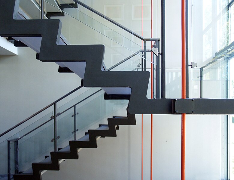
Arne Jacobsen- rodovre town hall, stairwell 1952-1956


               Scandinavian Design is prevalent today through the popular businesses Ikea and H&M.  Both companies are known for mass producing simple products that coordinate well with (almost) everything.  


Scandinavian design also resignates through scandinavian modern architecure, such as buildings Alvar Aalto and Arne Jacobsen designed.  I appreciate the scandinavian design concept because of it's appeal to the masses and is aimed for everyone including the "average joe", which every third world country has.  The products are well priced and are innovative in design and new forms.