

Monday, November 28, 2011
Wednesday, November 16, 2011
Cabinet of Curiosity Shelf Concepts
For my cabinet idea I have been looking at balancing hard and soft spaces. I didn't want to make a normal, run of the mill cabinet, so I decided on more of a showcase-shelf kind of display. My shelf is constructed out of stainless steel/aluminum/brushed nickel...something with a reflective quality that still has a pretty smooth finish, with glass bulbs to cover the artifacts. Around each of the glass bulbs is a small light to help showcase the artifact and create a light effect through/on the object or its container.
From left to right, the artifacts go from the cat collar box, to the tip of the reflective wave where you will find the silver bell, and below the curve the ring. In the cat collar's bulb, the light is located on the left side and in front of the box. I decided on two lights for this one only because the box has holes to see the collar through and I wanted to introduce the effects of light through those holes, which will probably create a circle light effect on the inside. For the bell, the light is located in the front below the bell. I chose to put it there because the bell container has a single opening in the front and if it is silver, as originally intended, the box should already have reflective qualities. The light for the ring box is located above the ring, so as to really create a dramatic light affect on the ring itself. The location of the lights helped determine where each artifact should be located.
I chose to create bubble-like bulbs to help showcase the objects and encourage the artifacts and their containers to be viewed from many angles, so the sphere shape really helps with that. Each artifact sitting on the silver curve have a small base to level the artifact. I chose encasings rather than an open shelf to play on the idea of creating a container for a container of an artifact. Another thing I noticed was all of the artifacts shared a round quality and were being put into a box of sorts, so I wanted to do the reverse and put the boxes in the circles.
My color palette is simple as it is a reflection of my materials (literally). I wanted to keep the palette clean and simple so as to unify the objects and show the "reflection" in the personal items.
Finally, I chose this concept because I like the idea of a heavy curve looking like it is balancing on a bubble. I think the optical illusion is very appealig to the eye and, again, helps draw the viewer to closer examine the artifacts and their containers.


Tuesday, November 15, 2011
www.lifemylief.com
More fun signage to check out...
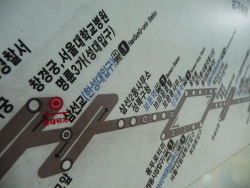 |
| Seoul Subway Map |
 |
| Purposeful Signage |
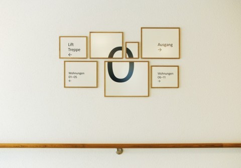 |
| Zurich Retirement Home Signage |
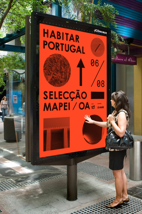 | |
| Portugal Street Signage |
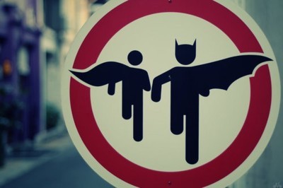 |
| Batman and Robin Zone... |
 | ||
| Sign in the Dublin Zoo |
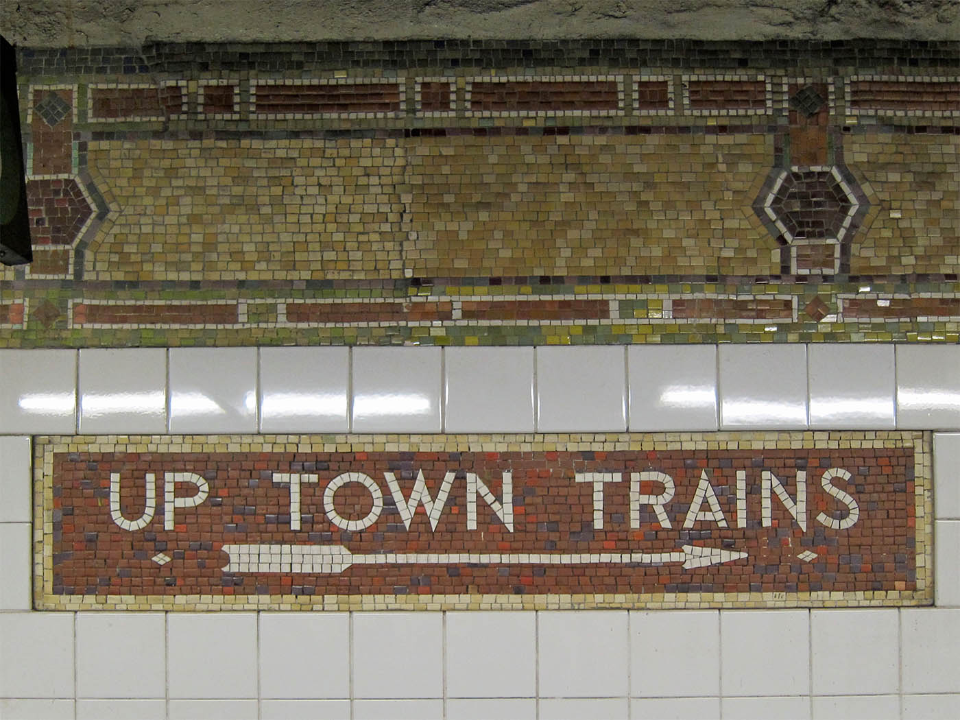 | ||||||
| I've always been very fascinated with not only subways but also the mosaic tiles in older subways that give it the creepy vintage feel. This sign, located at 86th Street in NYCreally echoes the times the subways has lived through |
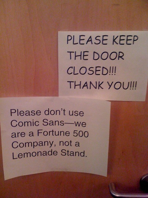 | ||
| Typeface is everything |
Signage Precedence
 | |

This example of signage is from the Milwaukee Art Museum. I like this example because it is simple and incorporates both material items as well as information on the monitor above. The layout on the tv echoes the repeated shapes on the wall below as well as the blocks of color in the background and probably around the rest of the museum.

I chose this office signage as my last collection of signs because it is an interesting way to switch the normal office signage up. I like the layout of this sign because it is laying different materials over one another which i think really works for this space since the wall is glass. The sign helps the office to stay open and airy while clearly indicating where things around the office are located.
Subscribe to:
Posts (Atom)